
Shapes are for decoration: a coloured panel behind text, a circle in the corner, a wave along the bottom. They follow your brand colours, so your layouts stay on brand when the brand changes.
You'll need: the editor role or higher.
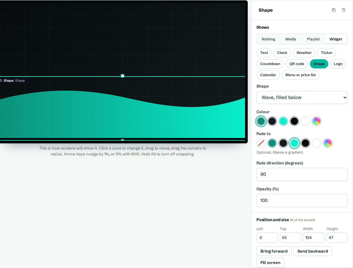
Add a shape
- In the designer, select a zone (or Add zone).
- Under Shows, choose Widget, then Shape.
- Choose the shape and colours, then select Save layout.
- Use Send backward so the shape sits behind your text. See Layers and zone style.
Settings
| Setting | What it does |
|---|---|
| Shape | Which shape to draw (see below). |
| Colour | The fill colour. New shapes start with your brand's primary colour. |
| Fade to | Optional. A second colour makes a gradient. Choose the empty swatch for a solid fill. |
| Fade direction (degrees) | Direction of the gradient: 90 is left to right, 180 is top to bottom. |
| Opacity (%) | How solid the shape is, from 0 to 100. Try 20 to 40 for subtle background shapes. |
The shapes
| Shape | Looks like |
|---|---|
| Rectangle | Fills the whole zone. Add rounded corners with Corner radius in zone style. |
| Circle or oval | A circle in a square zone, an oval in a wide one. |
| Ring | An outline circle. |
| Wave, filled below | A wavy top edge, filled underneath. Good along the bottom of the screen. |
| Wave, filled above | A wavy bottom edge, filled above. Good along the top. |
| Blob | A soft, rounded organic shape. |
| Slanted edge on the left | A block with a diagonal left edge. |
| Slanted edge on the right | A block with a diagonal right edge. |
| Rounded corner | A block with one big curved corner. |
| Dot pattern | A grid of small dots, for texture. |
Shapes stretch to fill their zone. To make a perfect circle, make the zone square on screen: on a landscape layout, that's a zone whose width is about 56% of its height in percentage terms (for example Width 18 and Height 32).